How to Properly Review & Evaluate A Logo Concept
For over 20 years, Reckon Branding has created and updated brands for countless Atlanta-based companies. We often find ourselves educating our clients about how to best evaluate the logo concepts we present. We not only want them to love what they see; we also want to be sure they are reviewing the concepts with a strategic eye.
The logo itself is often viewed as the most important component of a brand, as it’s the part that gets the greatest attention from leadership and where the most agency/client collaboration happens. Conversations can become intense if personal preferences and subjective viewpoints differ from person to person.
Navigating the logo review process can be a bit tricky, so we have developed a guide for how to properly evaluate a logo concept when working with a branding agency. Not only will this give you guidance in reviewing a logo concept but asking the following questions and understanding the importance of them will allow you to focus your team as you navigate this journey.
1. Is the logo being created for you or your customer?
While you should be proud of your logo, you should really be more excited if your customers are able to remember it, see it as being unique, and feel it connects with the brand experience they have when working with you. Try to evaluate a logo concept from the perspective of your customer instead of your personal preferences.
When designing logos with only internal direction, the result often ends up being more of a reflection of the most vocal stakeholders’ opinions rather than a mark that supports a unique positioning for the brand. Doing a little research and some interviews beyond internal stakeholders will provide better insight to create a brand that connects with your customers. Be wary of any creative team you may be interviewing who plans on creating a logo using only your input. Ultimately, your logo is being created for your customer, not you.
2. Does the logo concept try to tell the whole story?
When reviewing logo concepts, you may see a logo on a blank white page. It is important to remember that you will likely never view your logo this way again. Let that sink in. Your logo will always have context. It will always be on a brochure or website with messaging, or on a business card as a living human being is handing it over.
Communicating the full story of what you do is not a prerequisite for what makes a “good” logo. If anything, one should steer clear of logos that are too detailed and descriptive. These can quickly become outdated as your company grows, adds new services, or new technologies change the way you do business.
Your logo should be unique, memorable, and not get in the way of the brand tone or essence. We often compare a logo to a handshake. A conversation starter. Like the shirt you choose to wear. A dress shirt may set up professional expectations, but how you communicate and handle yourself defines you as an individual beyond your clothing choice.
3. How does the logo concept compare to your competition?
Be sure to evaluate a logo concept with your competition in mind. Type, color, and design elements are visual cues one will quickly associate with your brand. For example, if all your competitors use blue, then maybe you should pivot in a different direction. And, if blue makes sense for your industry, you can incorporate it as part of your color palette but leading with it may not be the smartest choice.
Don’t see your competition as just those companies you are familiar with. There could be upstart brands making headway who could be viable competitors in the future that you aren’t aware of yet. Dig beyond the surface to find your competition. This can be as simple as Googling your service or industry and seeing who comes up. And if you are more regional, be sure to look beyond your current territory. Who knows, in three years you may be doing business in a totally new area of the country.
4. Does the logo concept embrace your unique positioning?
As an extension of number 3, your logo should reflect how you are different from your competitors as best as it can. Meaning, if a key differentiator is using the latest technology and cutting-edge approaches, your logo and brand should include qualities that reflect that. If your key differentiator is being eco-friendly and natural, your brand might look completely different. Designers use type and color to help communicate tone and personality in a logo design. Photography styling, design elements, and a broader color palette are used to help support a logo design and further communicate your unique positioning.
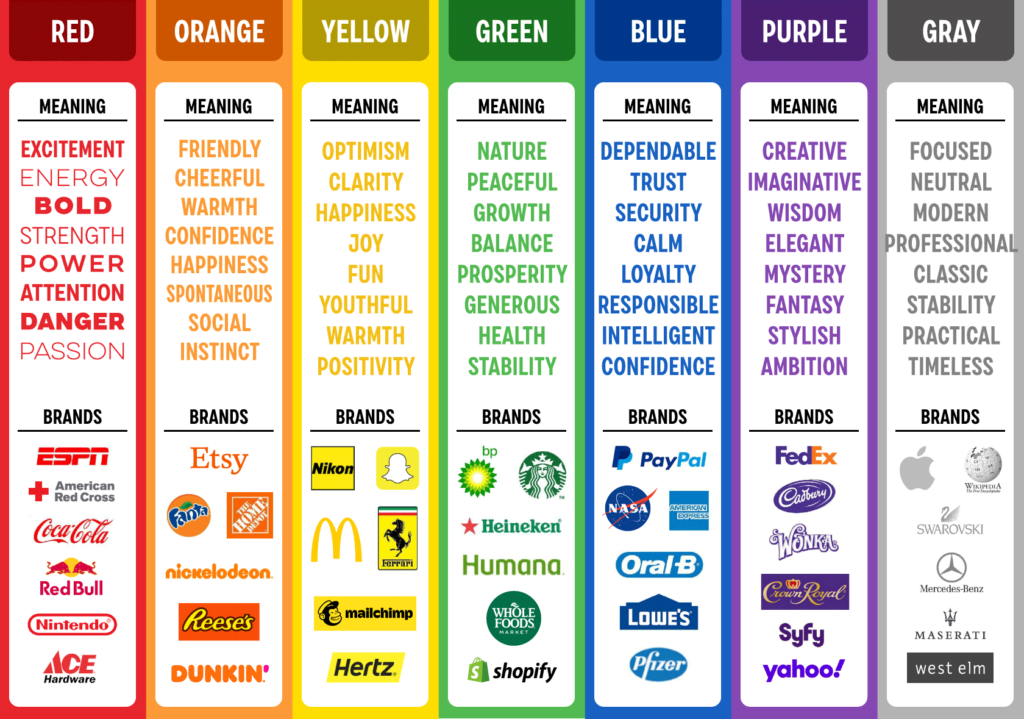
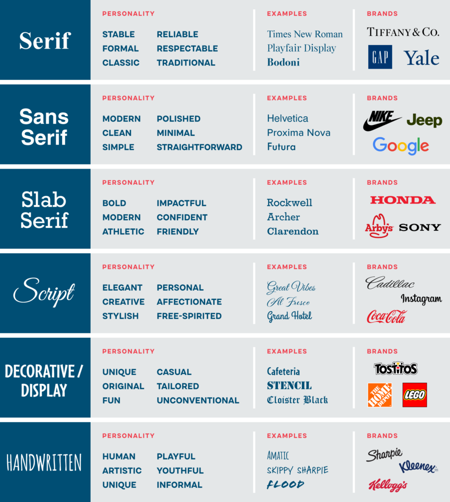
Your branding partner should be able to guide you through the design decisions they made when you are reviewing a logo concept. Below are some examples of how color and fonts communicate specific messages to your audiences.
PSYCHOLOGY OF COLOR

PSYCHOLOGY OF TYPE

5. Can the logo outlive design trends?
When evaluating a logo concept, ask yourself if it will look outdated in a few years. Many large brands that have been around for several years will update their logo to make it feel more current or relevant. With minimal adjustments, a good logo can be updated to embrace current-day design trends while retaining the unique and memorable aspects of the logo.
Here are examples of some well-known brands who have made adjustments to their logo over time without losing the foundational concept behind it:


6. Is the logo concept functional?
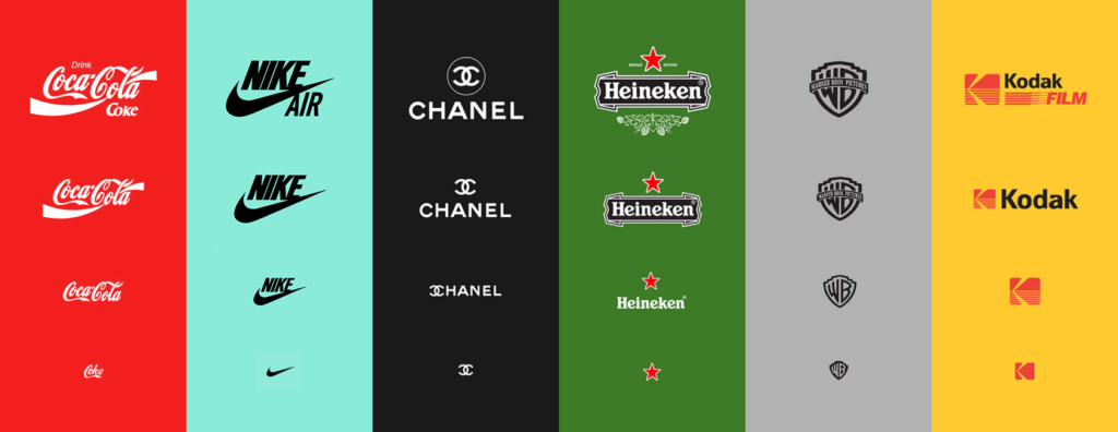
Will the logo work in various formats, orientations, and applications? This is really important to think about. The days of having a vertical and horizontal version of your logo are long gone. Today, logos need to be able to adapt to the unique environments of new technologies that will connect your brand to your potential customer. This is called a responsive logo or responsive branding. Just like responsive web design, a logo should be scalable, and able to adapt to any size and environment while retaining its recognition.
A good rule of thumb as you review a logo concept is to think about how your logo can be modified for an app icon, simplified for stitching on a hat, or screen-printed in one color on a t-shirt.
Here are some examples of responsive logos:

In summary, here are six keys in how to evaluate a logo concept:
- Put your customer’s perspective front and center, not your personal preferences.
- Don’t ask the logo to explain everything you do.
- The logo should be distinctly different than the logos of your competitors, and should not reflect similar qualities.
- The logo should support how you are unique from your competitors.
- The concept behind the logo should outlast design trends.
- Make sure the logo can be reproduced in various formats without losing recognition.

